Eledo
A quick overview.
Eledo is...
Eledo is a new app I specifically designed to help me (and other creative, super-busy people) stay out of overwhelm, manage their focus and get more done.
It's available for iPhone and iPad and soon for Mac.

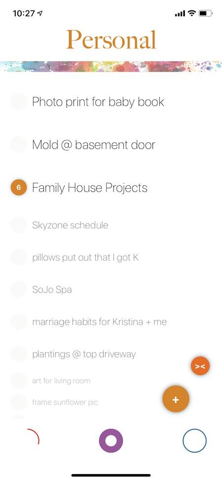
Sneak Peek!
Notice:
- The the orange circle with '6' next to "Family House Projects', indicating six sub-tasks.
- The different length arcs at the bottom of the screen representing how "fully" each priority list is.
- The "fat" arc in the middle indicating which priority list is being displayed.
- The changes in font from the top to the bottom of the list to help the most important items stand out.
How to use Eledo
Eledo you stay out of overwhelm, manage their focus and get more done by helping you juggle a combination of immediate to-do's, strategic tasks, and ideas which come to you but which you want to keep track of but might never quite get around to.
Eledo arose from my own frustration with existing products which, while often quite powerful, took up MORE of my time with configuration, distracting features, and stress from seeing endless lists.
Eledo is perfect for effortlessly managing your "now", your "later", and your "maybe someday". While it can be used for project planning it is not designed to be a full-featured project-planning tool.
Principles:
- Clear Easy to distinguish between what's more important vs. what's less important, especially when (like me) you've got a bit of ADD and find long lists overwhelming and stress inducing.
- Intuitive Intuitively interact with the app like real-world notes by swiping, dragging and dropping.
- Relaxing The application should help you exhale, and be inspiring without being distracting.
UI Basics
- Title The title indicates which of the two zones you're currently in: Work or Personal. Each zone has its own set of three prioritized lists.
- Arcs Each zone has three priorities, each with its own list of items, which you can use any way you want: "now, later, someday", "today, this week, this month", "high, medium, low", it's whatever works for you; these are repesented by arcs.
- The more items a list has the longer the arc is. For example, a small arc means an empty or small list, while a completely closed circle means a list with many items.
- The "fat" arc indicates which list is currently being viewed.
- The general interpretation is the left-most list is highest-priority while the right-most list is lowest priority.
- Items Each list is composed of items, one per line.
- Fonts The items at top are in a slightly larger and darker font and the items at the bottom are in a smaller and lighter font; this helps you to naturally focus on the top items while allowing you to still see the rest of the list if you like.
- Circles A solid circle with a number to the left of an item indicates how many sub-tasks an item has.
Usage Basics
- Change zones by tapping on the zone title at the top of the screen. You can also change zones by tapping on the space between the completion arcs at the bottom of the screen.
- Choose which priority within the current zone to look at by tapping on its arc at the bottom of the screen.
- Tap on the '+' button or a blank area at the bottom of the list to create a new item.
- Swipe left and right to move items from one priority to another.
- Swipe left from the left-most list to mark an item as completed and remove it.
- Tap on an item to edit its text or change its zone from Work to Personal or Personal to Work.
- Long press and drag up or down to move an item within a list.
- Tap on the small circle to the left of an item to create or edit its sub-tasks.
